
When mobile payments get out of the way
A failed Visa payment and an effortless TWINT transaction reminded me what good mobile payment design looks like: the complexity is still there, but the user no longer has to operate it.


A good payment experience should make the underlying machinery disappear.
I was reminded of that while helping my 80-year-old mother-in-law in Switzerland buy a flight ticket on the SWISS website. Her familiar Visa payment failed without a useful explanation. TWINT, a Swiss mobile payment system I barely knew, worked immediately.
That small reversal changed how I thought about mobile payments.
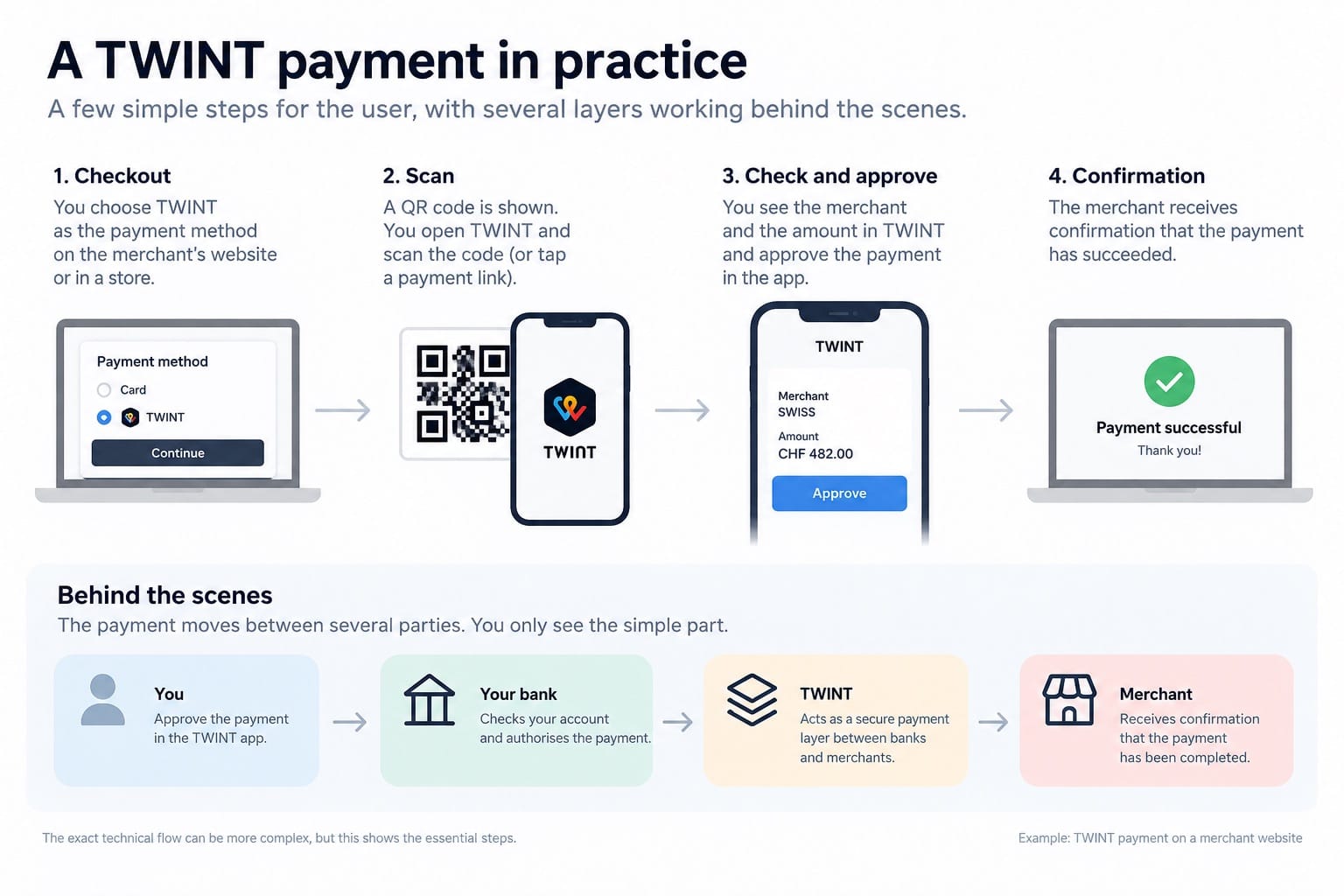
I had assumed QR-based payments added another technological layer. In practice, TWINT did the opposite. It reduced the interaction to something very simple: scan, inspect, approve.
That is what good payment design can do. The complexity does not vanish. It moves out of the user's way.
Then we noticed TWINT
I was helping my mother-in-law remotely. I could see her Windows desktop through screen-sharing software, but she still had to do the clicking herself.
The SWISS checkout was long. We worked through flight options, details, seats and confirmations until we finally reached the payment.
Her Visa card failed.
Why, we still do not know. It could have been the card, the bank, 3-D Secure, the payment provider or something else in the chain. From our side, it simply did not work.
Then we noticed TWINT.
I had barely heard of it and, to be honest, my first reaction was mild distrust. It involved a QR code.
My mother-in-law did not seem concerned. She picked up her phone, scanned the code, checked the payment and approved it.
Done.
After all the complexity of the familiar card payment, the unfamiliar Swiss mobile payment method was by far the simplest part of the experience.
What was actually happening
I looked it up afterwards.
TWINT is essentially a mobile payment layer connected to the Swiss banking system. For an online payment on a computer, the customer can scan a QR code in the TWINT app, check the merchant and amount, and approve the transaction there.
The details underneath can be more complicated, but the user does not have to operate that complexity. This is something I have been trying to understand for a while: how money actually moves, and the different layers behind a digital payment.
That also changed how I thought about the QR code itself.
I am still wary of QR codes in public spaces. A sticker on a parking meter or restaurant table can be replaced, and you cannot inspect the contents with your eyes.
But on a website I already trusted, the QR code was really only a hand-off. The important moment came afterwards, when TWINT showed the merchant and amount and asked my mother-in-law to approve the payment.
One more layer, less complexity
I use Apple Pay all the time. I have previously used it to explore how much payment infrastructure can disappear behind a good interface.
The Netherlands has long had iDEAL, and Wero is now changing that European payment landscape. Those systems are different, but this small Swiss experience gave me another way to look at the same development.
A new layer does not necessarily mean more complexity for the person using it.
I had assumed QR-based payments added another technological layer.
For my mother-in-law, that layer removed one.