Typography, in motion
In modern cars, text is no longer read but registered. Letters function like icons, designed for saccades, speed, and cognitive restraint.

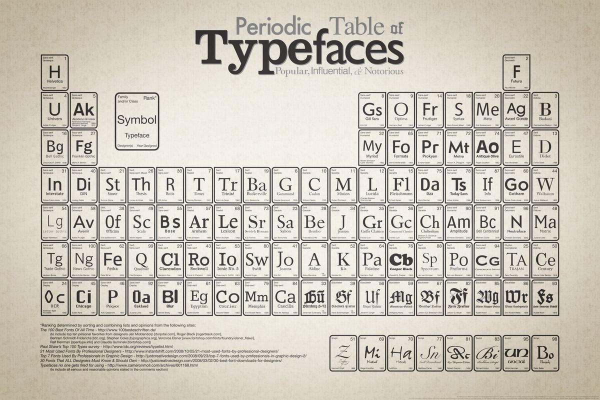
I have always had a soft spot for typography. Not as ornament or branding, but as infrastructure. Letters as dependable carriers of meaning, doing their work without drawing attention to themselves.
For a long time, typography felt like a settled discipline. Important, certainly, but largely associated with print and slower forms of reading. Books, essays, editorial layouts. Contexts where time and attention are available.
That assumption no longer holds.
Where reading now happens
Most of my reading today happens on screens. Short fragments on a phone. Longer stretches on a large desktop monitor. Sustained reading on an e-reader, where the typography is deliberately restrained and tuned for endurance rather than speed.
Each of these environments has its own demands. Screen size, distance, lighting, posture. Typography adapts accordingly, often invisibly.
The car introduces a very different condition.
The car as a visual interface
I would hesitate to call what happens in a car “reading”. It is closer to checking or registering. A glance rather than a gaze.
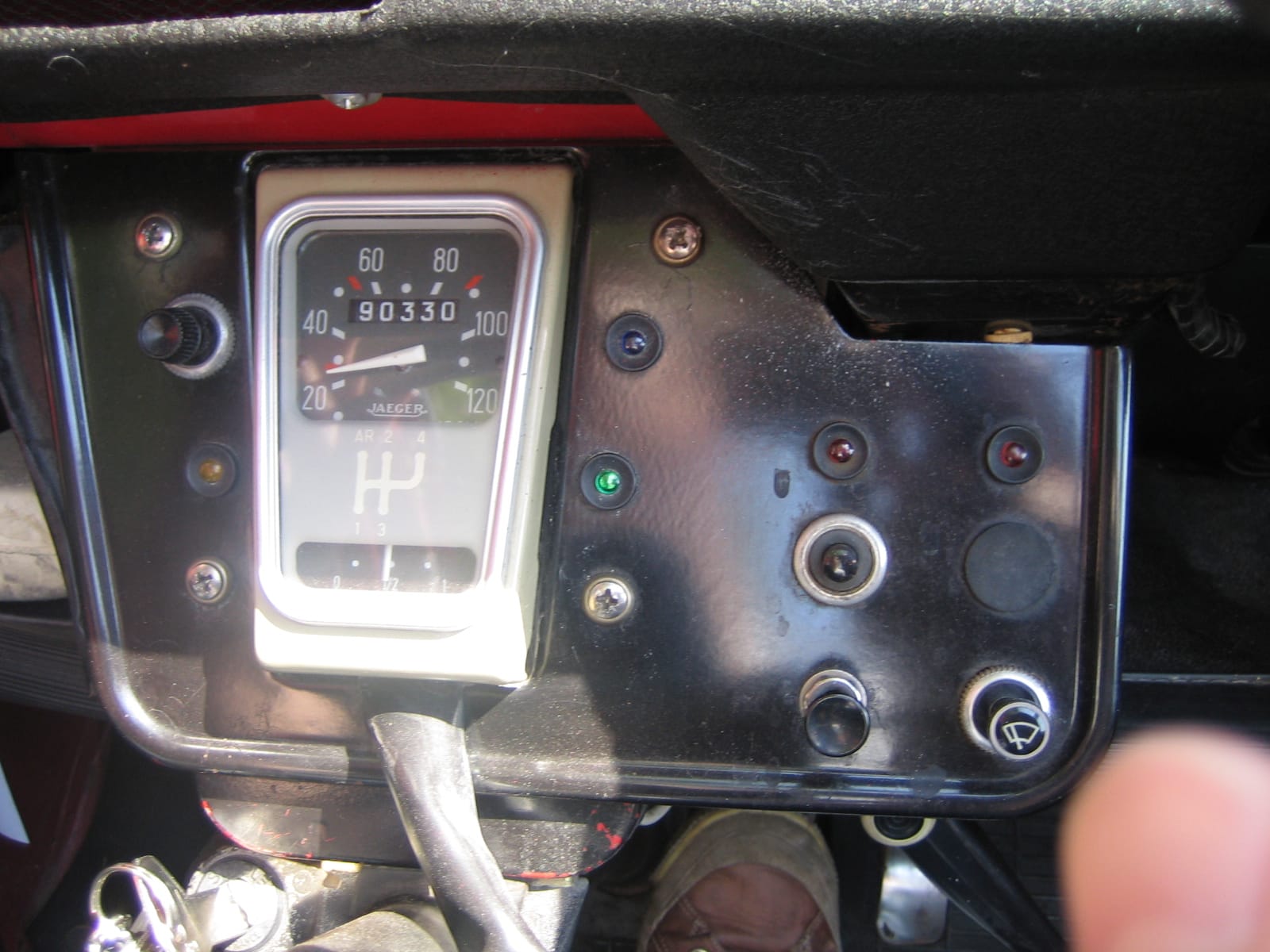
In more traditional cars, dashboards rely on physical indicators: dials, needles, icons. Information is conveyed through shape and position. Text plays a minor role.
In newer vehicles, screens take over. Navigation, system messages, warnings, media, communication. Information appears on central displays, instrument clusters, windscreens, head-up displays. The car now communicates continuously, largely through visual means.
Text becomes part of the interface.
Reading in a fraction of a second
In these environments, information must be processed under pressure. The driver’s attention is divided. Light conditions change constantly. The eye moves rapidly, guided by saccades: quick jumps from one fixation point to the next.
Typography here is not about elegance or expression. It is about immediate recognition. Letters must be legible in isolation, unambiguous at a glance, readable before conscious interpretation has time to intervene. Text approaches the role of icons.
This is where type design becomes a matter of ergonomics.
A typeface designed for the dashboard
Volvo’s Centum typeface is interesting precisely because it is framed in these terms. It is not presented primarily as a branding exercise, but as a functional one. Designed, tested, and refined for legibility in moving vehicles, across lighting conditions, and under cognitive load.
The goal is reduction of friction. Clear differentiation between similar letterforms. Open shapes. Calm rhythm. Nothing that slows recognition or invites doubt.
That it also reinforces Volvo’s brand values is almost incidental. The sense of calm, control, and restraint emerges naturally from the functional requirements. The brand is expressed through behaviour rather than decoration.
A personal hesitation about screens
At the same time, I remain ambivalent about screen-first car interiors.
Screens are emissive. They glow, day and night. Considerable intelligence is required to keep them legible: adaptive brightness, contrast shifts, glare reduction, compensation for tunnels and oncoming headlights. It works, most of the time, but it is a complex solution to a problem that physical controls largely avoid.
Knobs, switches, and dials communicate through touch and position. They can be operated without looking. Muscle memory plays a role. Information is conveyed through resistance and orientation, not light.
From that perspective, the rise of typography in cars is slightly paradoxical. Text becomes more critical precisely because interfaces demand more visual attention. Good type design compensates for a medium that is, ergonomically, still open to debate.
This is not nostalgia. It is a recognition of cognitive limits.
Typography across contexts
What makes this moment interesting is how clearly typography now responds to context.
In the car, letters are pushed towards speed, clarity, and near-invisibility. On my own blog, I recently made the opposite move. I returned to a serif typeface for body text, favouring reading comfort over neutrality. A subtle shift, but a deliberate one.
Serifs still support sustained reading. They guide the eye, soften rhythm, and encourage slower engagement. On large screens and e-readers, that matters.
Placed side by side, these choices underline the same point: typography is not a fixed style or a nostalgic craft. It is a living discipline, shaped by use, medium, and human perception.
I recently updated the body text of this blog, moving from one serif to another. I replaced Merryweather with IBM Plex Serif, which I find subtler in rhythm and more comfortable for long-form reading.
From clay tablets to dashboards
From marks carved into clay and wood, to ink on paper, to pixels on glass, and now to luminous text embedded in moving machines, the role of typography has remained remarkably consistent.
It mediates between humans and systems.
What changes are the constraints. Speed. Light. Motion. Attention. In the dashboard of a modern car, those constraints are unusually tight. That makes typography less visible, but more consequential.
Perhaps that is why it still fascinates me. Not because letters are beautiful, but because, millennia on, they are still doing the quiet work of making complex systems legible, even when time is scarce.