GPT Image 2 Changed My Mind on AI Visuals
I had quietly written ChatGPT off for image generation. Then GPT Image 2 showed me a technical diagram of a washing machine, and I had to revise that judgment.

I had, without quite deciding to, written ChatGPT off for images.
The earlier output felt like a tool optimised for fantasy illustrations, product mockups, and memes. Useful for some things. Not for the way I work. My interest in visualisation has always been functional: diagrams, schematics, process maps. Images that explain something rather than represent something. For that category, AI image generation had consistently disappointed.
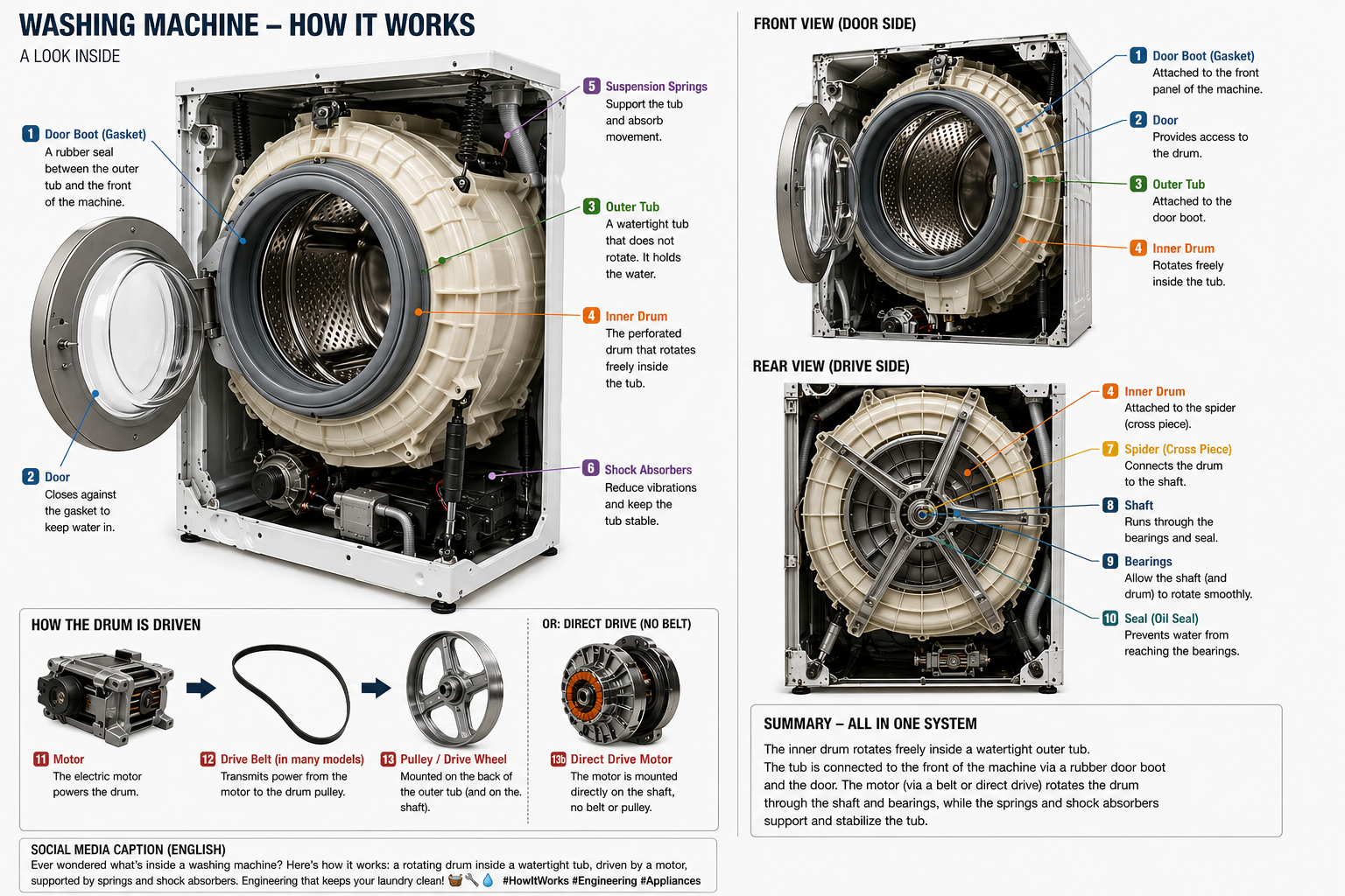
Then last week I needed to understand how a washing machine actually works internally. The inner drum, the outer tub, the bearings, the door seal, where the shaft exits the housing. Text descriptions get you some of the way. A diagram would get you further. So I asked ChatGPT Images 2.0, running on the new GPT Image 2 model, to generate one.
What came back made me revise my assessment.
What arrived
The output was not a pretty picture of a washing machine. It was a coherent technical infographic: multiple views of the same machine, labelled components, readable typography, front and rear logic, the drive belt and motor in correct relation to each other. It carried layout hierarchy. It had editorial polish. It looked less like image generation and more like a service manual that had not yet been published.
The surprise was specific. A washing machine is a good test precisely because it has no aesthetics to fall back on. The image is either mechanically correct and useful, or it is not. But the deeper surprise was repeatability. This was not a lucky render. The model had reasoned about what a washing machine actually is before generating anything, and that showed in every label, every cross-section, every spatial relationship. You could ask again and get something coherent. That is new.
Why this category matters
The images I care about are not decorative. Every organisation explains something: how a process works, how a system fails, what happens in a given sequence. For years, turning that complexity into a clear visual required time, a specialist, and budget. The bottleneck was not the knowledge, it was the production.
GPT Image 2 is built around the idea that the model thinks before it draws, reasoning about what an explanation actually requires before generating anything. Text inside images, historically the biggest weakness of these models, has improved substantially: labels, signage, UI elements, correct spelling and consistent spacing.
The result is a model that does not just render, it plans. And because it understands the subject before it draws, the output is repeatable: ask the same question twice and you get something coherent both times, not two unrelated lucky guesses. That is the shift. Not better art. Better explanation, on demand.
The category I had dismissed
Many people still assess AI image tools by the use cases that dominated the first wave: avatars, memes, synthetic photography, visual gimmicks. That assessment is not wrong, it is just stale.
The more consequential category is knowledge visuals: images that help a professional understand something faster than prose alone. Technical diagrams, process flows, onboarding schematics, infrastructure maps. The kind of thing that organisations need constantly and produce slowly.
If that gap is now measurably shorter, the operational implication is significant. Not because designers are replaced, but because explanation becomes cheap enough to happen more often.
I only wanted to know how my washing machine works. The diagram that came back raised a different question: what else is now explainable in minutes that previously required a budget line?