Colour, systems, and the moment it clicked
A Japanese colour book, a digital-first brand, and a late encounter with Pantone led me to finally understand why print colour always felt confusing.


For most of my working life, colour was a digital thing.
I designed on screens, judged on screens, published on screens. Print existed somewhere in the background, but it always felt slightly opaque. Colours came back different. Deeper on screen, flatter on paper. More constrained. More brittle.
I accepted that as one of those things you “just had to know”, without ever really understanding why.
That changed recently, through a combination of a book, a branding question, and a slow realisation about how colour systems actually work.
A book I still love
The immediate trigger was A Dictionary of Color Combinations, based on the colour studies of Japanese artist Sanzo Wada and later compiled by Seigensha, which I was given as a present.
It is a lovely object. Calm, precise, generous. It does not define colours in isolation, but shows how they behave together. Pairs, trios, quartets. Harmonies rather than absolutes.
It is inspiring in a very practical way. For clothing. For interiors. For branding. I still use it, and I still love it.
What struck me, though, was a review that mentioned that the colours “used to be richer and deeper” and that newer editions felt flatter, more CMYK-like.
At the time, that comment lingered. Only later did it start to make sense.


A dictionary of color combinations
Designing our own brand, digital first
Around the same time, I was looking back at our own brand.
We designed it ourselves, deliberately. Two colours. A deep blue and a pinkish glow. They are not arbitrary. They are derived from Earth’s shadow: the darkening blue of the shadow itself, and the pink glow caused by atmospheric scattering at its edge.
Those colours came from observation, not from a colour book.
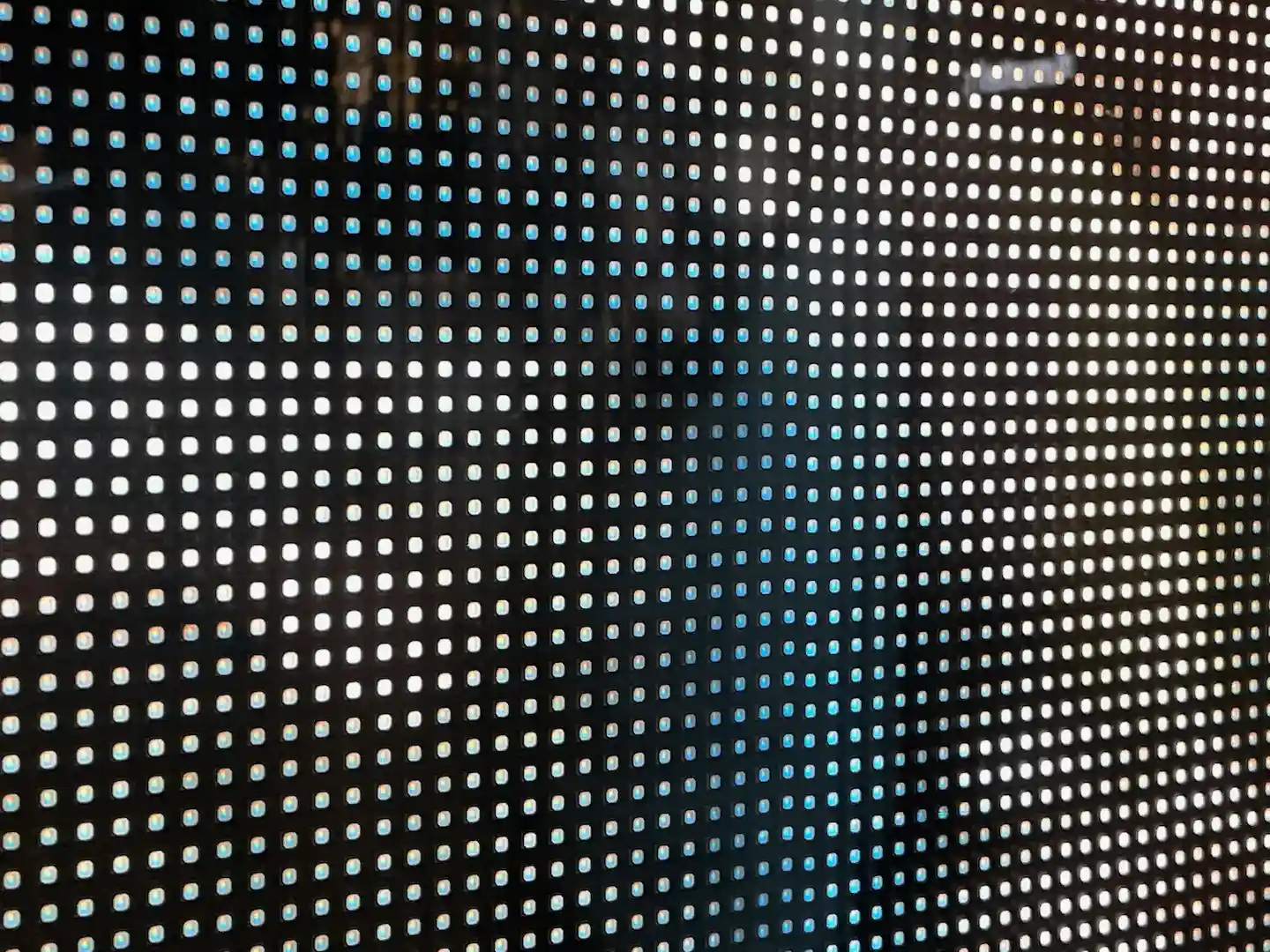
From the start, the brand was digital-first. Screen-native. Light-based. So when I checked the original files, there were no Pantone values. No CMYK intent. Just RGB.
That was not an oversight. It was simply where the design lived.
Only later did the question arise: if we ever want to print this properly, what are these colours?
Two very different kinds of “print colour”
This is where something important finally became clear to me.
Pantone and CMYK are often mentioned together, but they are fundamentally different kinds of colour systems.
Pantone colours are defined. They are closer to pigments. They exist as named, specified inks that are mixed deliberately and printed as such. If you choose a Pantone colour at design time, you are making a conscious commitment to a physical colour.
CMYK works differently. It is not a set of colours, but a reproduction system. Colours are built up from tiny dots of cyan, magenta, yellow, and black, arranged in patterns that the eye blends together. It is about simulation rather than definition.
That distinction matters more than I realised.
Pantone answers the question:
Which colour do we want, materially?
CMYK answers a different one:
How can this colour be reproduced, reliably, at scale?
The Pantone myth
For a long time, I implicitly assumed that Pantone values were somehow hidden inside files, waiting to be uncovered. That if you just looked hard enough, you would find “the real colour”.
That turns out to be wrong.
Pantone is not something you recover. It is something you choose.
If Pantone was not defined at design time, it does not exist. Anything you assign later is a closest match, a judgement call, an approximation. However precise it looks.
That was the first real eye-opener.


Quick search for our logo colours.
CMYK as translation, not failure
CMYK, by contrast, is a translation.
Given an RGB or HEX value and a colour profile, the conversion to CMYK is deterministic and mathematical. The same input will produce the same output.
But it is also constrained.
CMYK lives in a smaller colour space. Ink on paper reflects light; it does not emit it. Some colours simply cannot survive the translation intact.
So when people say CMYK “flattens” colours, that is not a technical failure. It is a physical reality.
CMYK does not fail to express richness. It expresses the maximum richness that can be reproduced reliably.
That reframing changed everything.

What happened to the colours in that book
With that understanding, the comment about A Dictionary of Color Combinations clicked into place.
Earlier editions were closer to pigment-first thinking. Colour as material, ink, paper, light. Later editions prioritise reproducibility. Standardisation. Portability across printing processes.
The colours did not become flatter by accident. They became legible to a system.
That is not degradation. It is translation across worlds.
And once you see that, the book does not lose its value. It gains context.


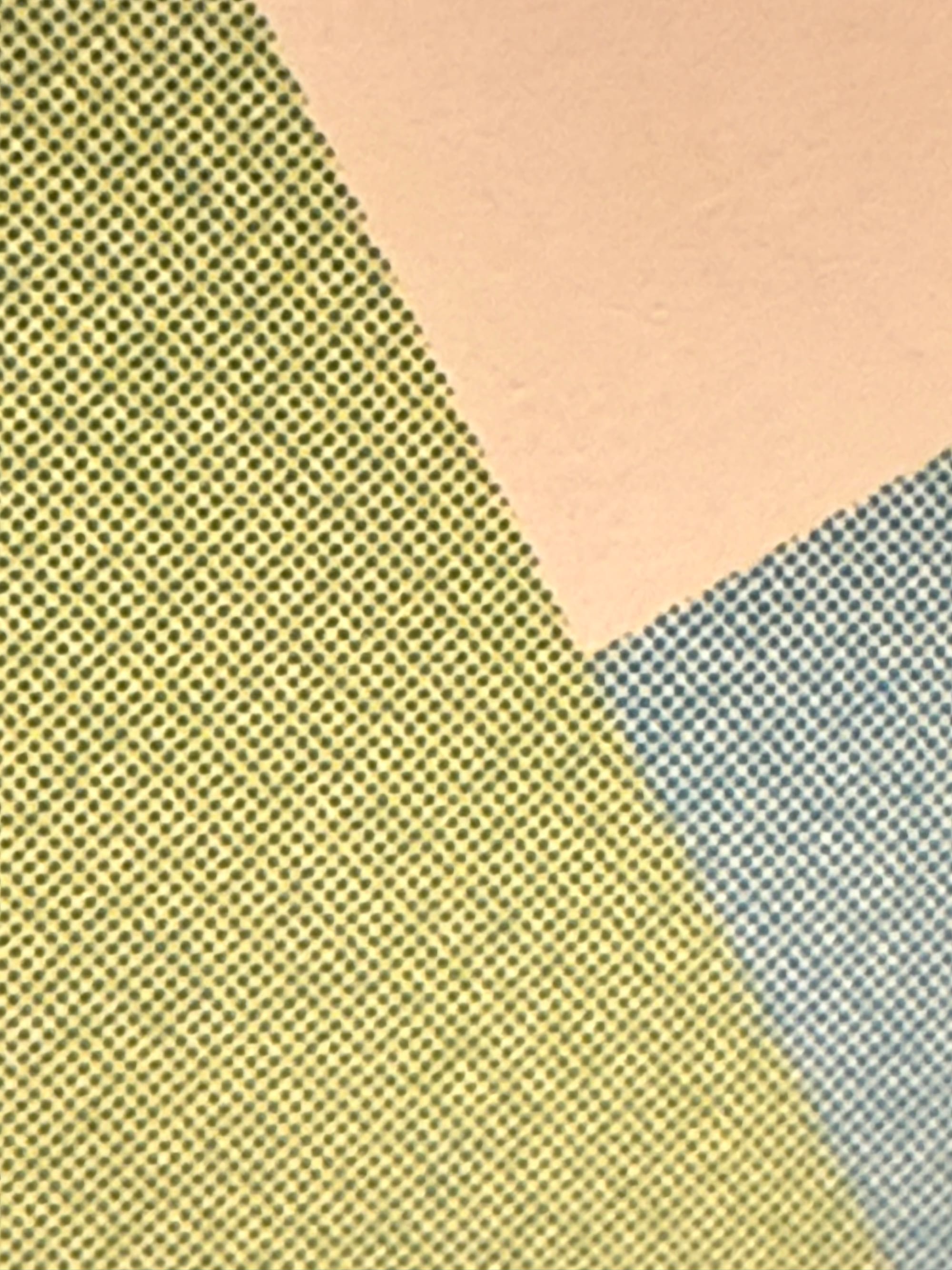

CMYK at work in the book. Magnification with iPhone.
You can only define colour inside a system
This is the core insight I wish I had earlier:
You can only ever define colour inside a system.
Moving between systems always requires judgement.
RGB, CMYK, Pantone, pigment. None of them are wrong. They just answer different questions.
If you start digital-first, you postpone certain decisions. When you later move to print, you are not uncovering hidden truths. You are making assumptions explicit.
That is not a mistake. It is a normal sequence.
RGB at work
Where this leaves me
This may sound like a narrow design concern, but for me it was a genuine moment of discovery.
Not because I finally “understood print”, but because a whole area that used to feel fuzzy suddenly became legible. Colour stopped being something that either worked or didn’t, and became a set of choices, translations, and constraints that I can reason about.
That shift is oddly energising.
It raises better questions. It opens up new ways of thinking about branding, reproduction, and design decisions I had previously postponed or avoided. It also makes me look differently at objects like that colour dictionary, not as flawed or diminished, but as situated in a particular system with its own logic.
I still love the book. I still use it.
I just enjoy it more now that I understand what kind of space it occupies.
And perhaps that is the real pleasure here: not having arrived at an answer, but having gained a new way of seeing, with many more directions to explore.