Mapping AI Exposure Across the Dutch Labour Market
From US model to Dutch labour market in an afternoon, using AI and public data. A small project that says something larger about data work.

I set out with a fairly contained question: what does AI exposure look like when you map it onto the labour market? In that process I came across a model of the US job market that had already disappeared. What remained was a fork, incomplete but workable, and that was enough to start rebuilding it.
What began as a reconstruction gradually turned into something else. Not only an attempt to understand the Dutch situation, but also an exploration of how this kind of work can now be approached at all.

Translating across systems
The core challenge was not technical in the narrow sense, but structural. The original model was grounded in US job classifications, and those do not translate directly into a European or Dutch context.
So the work became a layered translation. From US roles to ESCO classifications, and from there to Dutch CBS data. That mapping step is where this kind of analysis usually becomes slow and specialised, because it requires both domain understanding and a fair amount of manual alignment.
What changed here is how that alignment was done. I used a coding assistant to work through the repository and adapt the structure, but I also relied on AI in a more interpretive way, using it to match categories across systems. That kind of classification work would normally be painstaking and manual. Here, it became something you can iterate on, check, and refine in dialogue.
A stack of tools, compressed in time
Looking back, what stands out is not just that it worked, but how it came together.
Different layers of AI were involved, each playing a distinct role:
- a coding assistant to reconstruct and adapt the model (Claude Code)
- an LLM to reason across classification systems and suggest mappings
- another layer, including ChatGPT, to structure, explain, and publish the result
What would previously have been a sequence of specialised steps collapsed into a single workflow. Not perfectly, and not without judgement, but within the span of an afternoon.
That compression of time is perhaps the most tangible shift. It changes not only what is possible, but also what feels reasonable to attempt.
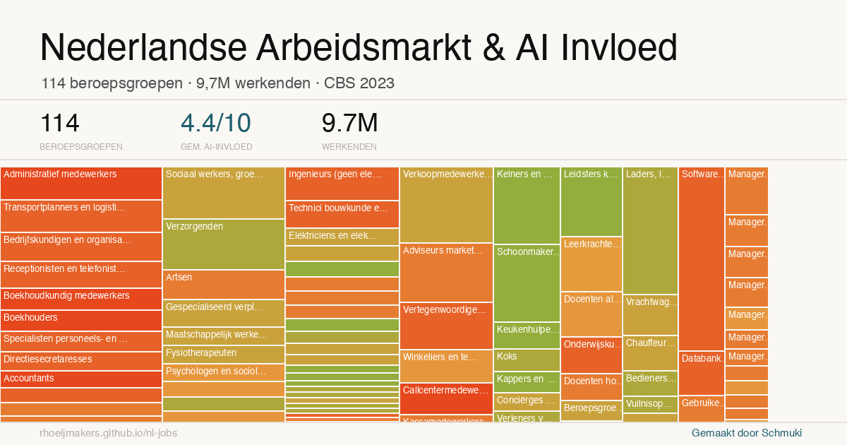
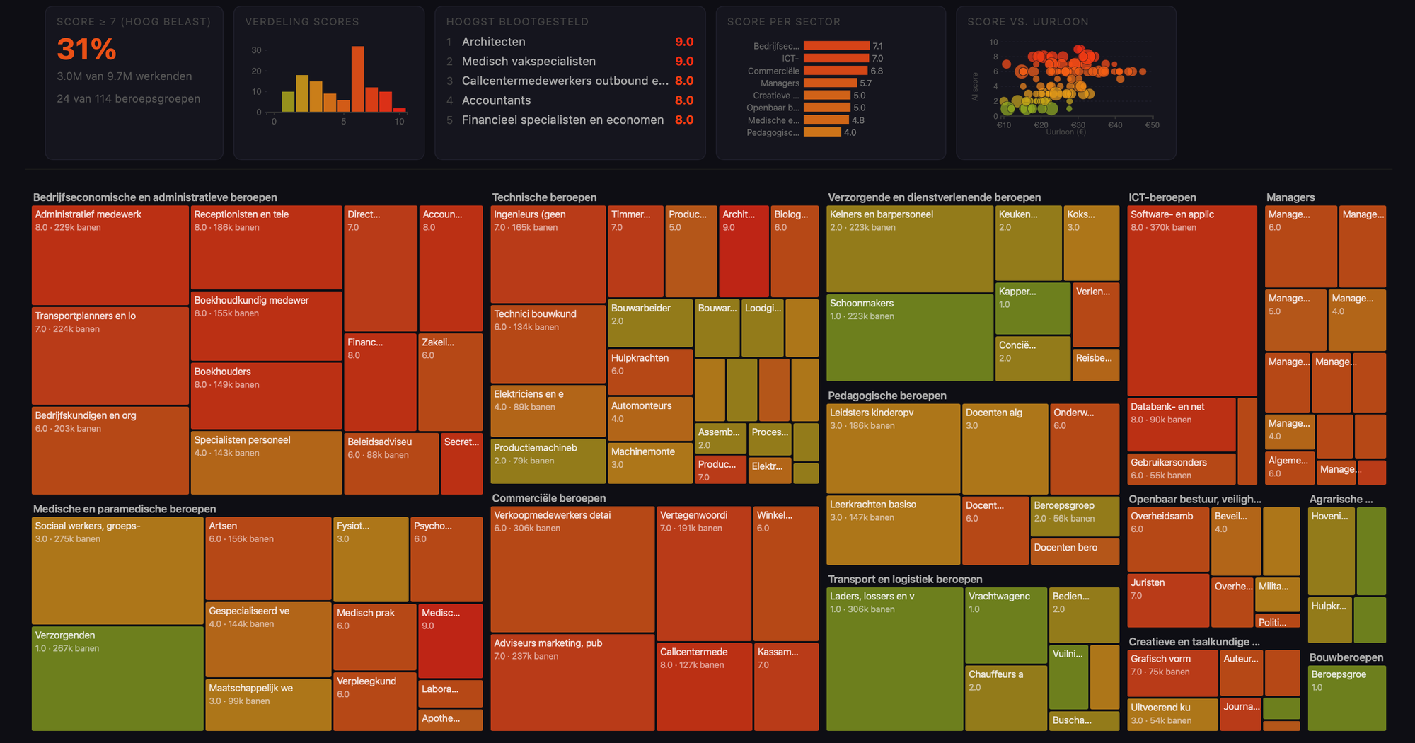
A chart that behaves like a map
The resulting visualisation is, strictly speaking, a bubble chart. It combines multiple dimensions: AI exposure on one axis, job volume on another, and economic weight reflected in the size or colour of each point.
But in use, it behaves more like a map. You are not analysing individual points in isolation, but scanning for concentrations, for areas where pressure might build up, for combinations of exposure and scale that start to matter.
That makes it a useful form for this kind of question. It does not resolve the issue, but it creates a surface on which more informed questions can emerge.
From output to shared artefact
Publishing the model via GitHub and GitHub Pages was a deliberate step. It turns the work into something that can be inspected, questioned, and extended by others.
Instead of a static report, it becomes a small public artefact. The assumptions are visible, the structure can be followed, and anyone can take it further by forking or adapting it.
That changes the dynamic from presenting conclusions to enabling iteration.
Options for the map
Moving into data work, and what that means
What I found most striking is that I could do this at all. I am not a data scientist, and this is not typically the kind of model I would build. And yet, with the current generation of tools, it becomes possible to move into that space and produce something that is at least directionally meaningful.
There is a clear sense of satisfaction in that, but it also raises a broader question. If more people can do this, what happens to the value of this kind of work?
When the production of structured, convincing visualisations becomes easier, the signal they carry becomes less reliable. The risk is not only error, but overconfidence in what looks well-formed.
A shift in where the value sits
What seems to be happening is not a disappearance of expertise, but a relocation of it. The effort required to produce the artefact decreases, but the importance of framing, validation, and interpretation increases.
Decisions about how classifications are aligned, how proxies are chosen, and how limitations are handled remain decisive. Those aspects are less visible in the output, but they shape its meaning.
Working through this yourself makes that more tangible. It creates both appreciation for the underlying work and a certain distance from the result.
Closing
For me, this project sits somewhere between curiosity and capability. It started as a way to understand a specific question about the labour market, but it ended up revealing something about the broader shift in how we work with data.
There is a quiet satisfaction in being able to build and share something like this, not because it is definitive, but because it opens a space for exploration.
And perhaps more importantly, it shows how much can now be done, carefully but independently, in the span of an afternoon.